Tuesday, 29 December 2015

Trees and Stuff

Hellooo!
 Hope you've all been enjoying the festive season by listening to Mariah Carey's 'All I Want For Christmas Is You' a concerning number of times.
A couple of days ago I took some pictures with a Holga Turret Lens ; I really liked the lo-fi images that can be created really quite easily.I found the 'colour filter turret' worked well when shooting woodland areas and instantly made the images  more interesting-  the options on  'special lens' turret I thought were better suited to buildings/etc.
The pictures below were taken using the yellow filter/one of the many kaleidoscope-y options on the turrets.


 I definitely need to continue using this lens on varying subject matters to reach its full potential - I think it could create some really interesting portraits.But for now I thought I'd share a few of these dark blurred pictures of trees and stuff.
Kate
xo

Thursday, 10 December 2015

Blue Christmas

Ok so I've been pretty distant from this blog , lots of stuff going on like school etc. etc. , but I thought I'd share with you guys some stills from a new short that I've been working on.
I wanted to create a mainly visual piece , trying to focus on the colour palette/framing/change in focus as opposed to story line. 
I'm planning to overlay the visuals with  a spoken rendition of "In The Bleak Midwinter" - highlighting the themes of Christmas and juxtaposing colder elements of the festive season with the lights/magic/warmth.


 Also , Shia LaBoeuf is doing a  performance art piece in Liverpool , as part of FACT's exhibition 'Follow' this weekend , and I'm freaking out because I desperately want to see him/meet him so that I can talk to him about art and conspiracy theories and  Even Stevens.
I'll keep you updated on whether or not I get to meet an actual cannibal Hollywood superstar, 
Kate
xo

Sunday, 16 August 2015

Drone

Whilst in Scotland vising family , I went to see an exhibition of the Helensburgh Art Club's work and I photographed some of my favourite pieces.
And the stained glass windows provided a beautiful warm yellow light in the gallery.


I really liked these paintings by Chris Warren , to me they were some of the most interesting.


 These are some of the other works that caught my eye.


On a completely unrelated note , FIDLAR released the official music video for their (relatively) new song , 'Drone' this week...
And it's fantastic.


*It almost seems ridiculous to have FIDLAR even mentioned in this quiet and gentle post about a small art exhibition- but whatever*
 Kate
xo

Tuesday, 11 August 2015

X-men , Nu-rave and The Gruffalo : An interview with the Typical Freaks

Typical Freaks is an exciting new conceptual street wear brand made up of Central Saint Martin's Graduate , Seun Ade-Onojob and London College of Fashion Graduate , Sonia Xiao : together they aim to cater to those who long to stand out in bold and colourful , hand-crafted garments made with love and integrity .
I love everything about this brand  - the loud prints , adorable a-line skirts, the transparent tunic dresses  and the way the seem to bring a subtle feeling of  nostalgia to their pieces.
I decided to get in touch with these innovative designers and ask them a few questions about what its like to be the Typical Freaks.
Seun and Sonia talk X-men , The Gruffalo and Nu-Rave ( as well as other things that hold relevance)

I read that some your garments derive from 'the nostalgia of children’s books' - if Typical Freaks lived in a children's book , which one would it be?
The Gruffalo.


I also read that both of you were prominent designers in the 'Nu-rave scene during the mid-2000s' , could you explain what exactly Nu-Rave is and what was it like?
Nu-Rave was about being bright and exuberant and incorporating as many disjointed DIY and outlandish elements. It was about revitalising and re-interpreting 90s Rave culture into a new way that forced you to be fearless and confident.

Model: Edyta WillimMUA: Maria GomezSpecial thanks to: thisisfred.co.ukJonathan Aston


What do you like the most(and the least) about working in fashion?
Most - 
The process of developing a collection from research to design and then looking back at then end and realising how far you've come. 
Worst -
 The pressures of trying to sell, make something commercially viable and networking.


Who would your dream model/spokes person be?
Kelis/ Roisin Murphy


What do you see the future of 'Typical Freaks' being?
Hopefully continuing to improve and getting more stockists.

Model: Edyta WillimMUA: Maria GomezSepcial thanks tothisisfred.co.ukJonathan Aston

Model: Edyta WillimMUA: Maria GomezSpecial thanks to: thisisfred.co.ukJonathan Aston

If you two were designing clothes for a movie , what would the movie be about?
It would be about X-Men and would be directed by Edgar Wright. It would be really silly and colourful. 

Model: Edyta WillimMUA: Maria GomezSpecial thanks to: thisisfred.co.ukJonathan Aston

Could you briefly sum up your AW15 collection?
It's about conservative values and hobbies like politics and dog shows combined with punk, bright colours and streaking.

 Model: Edyta WillimMUA: Maria GomezSpecial thanks to: thisisfred.co.ukJonathan Aston

And how can we get hold of your beautiful clothes??
Our mainline AW15 collection is sold in a few boutiques in China, but will hopefully on our own website within the next couple of months. Our diffusion label, 'White Label' is on Depop.

I found this really great shoot for After Nyne  with Ted Rogers wearing some of their clothes on their Instagram - you should definitely check it out. 


Thanks so much to the Typical Freaks for allowing me to ask them a few questions to get a better feel for the brand and their ideologies , if you want to find out more visit here.

Kate
xo

Wednesday, 5 August 2015

Painted

I visited the Liverpool Bluecoat the other day to see their current group exhibition on display:"RESOURCE" , with work from Clay Arlington, Jack Brindley, Ben Cain, Maurice Carlin, Daniel Eatock, Sean Edwards, Anne Harild with Blue Room, Jonzo, Laurence Payot, The Piracy Project, The Serving Library and Ian Whittlesea.
I took some pictures:


Some of the pieces were quite interesting , and required a close look. The volunteers there were really friendly and helpful , one even explained each piece in one of the larger rooms to me.' RESOURCE ' is a free exhibition   at The Bluecoat until 27th September .

 In other news, I got my ears pierced recently , something that I had been meaning to do since the age of around 12 . I went to a  lovely piercing , tattoo and beauty studio called The Painted Ladies. The studio itself was immaculately decorated and all the staff made me feel very welcome and most of all at ease (considering the impending destruction of my earlobe).
 I wish I had taken pictures to show you how pretty the place was , I was surrounded by vintage record players , kitsch couches and dainty tea cups.To top it all off they gave me an after care package which was so adorable. I would definitely recommend it to anyone considering getting a piercing in the near future.


Kate
xo


Wednesday, 29 July 2015

Pretty Vacant

This is a super quick photo post.
These are a few pictures from this summer , which I felt seemed as though they should be part of a set.
Each conveying a sense of vacancy whilst maintaining an almost regimented colour scheme - it looks as though I  was looking out for these slate grey, blue & purple hues that all fit together so well.


Kate
xo

Thursday, 11 June 2015

Liverpool School of Art and Design Degree Show


The Liverpool School of Art and Design's 2015 degree show combines a variety of disciplines including Architecture , Graphic Design & Illustration , Fashion and Fine Art. I had a wander round today and photographed some of my favourite pieces.
The building itself allowed large amounts of natural light to enter the spacious gallery , adding a relatively unusual quality to my pictures (as I'm used to generally artificially lit galleries).


Graphic Design and Illustration

I was drawn to the bold colourful canvases of Sana Iqbal's "Impossible until Done" , her works demand attention with an initially simplistic concept and use of bright colours , find out more here.


A series of posca pen illustrations by Lois Tierney are inspired by the Czechoslovakian film 'Daisies', the mustards and pale blues compliment each other really quite beautifully.To learn more about this artist , visit here .


I forgot to make a note of the artists of the following works , but I really loved the way the light complimented the black and white portrait-of-sorts with the face replaced by flowers.


Fine Art

I found the Fine Art rooms as some of the most limited , I think this may be due to me missing out a room as it felt like there were only a few students' work on display.
However , there were a few stand out pieces - some paintings and others more obscure mediums. 


I know very little about this piece , but I do know that it was the perfect importunity to photograph the bottom half of my outfit.The space was painted matte black with a single spotlight on the mirror - it kind of made me feel as though I was in an oil painting for some reason.


Fashion

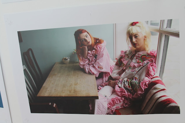
It pains me to say this ,but I was disappointed with the Fashion Exhibition - it was almost completely magazine editorials and no physical clothes , it felt that the room was more about the photography than the clothing itself.
Despite the clever use of space for a two dimensional medium (photographs) , it seemed unclear to me what clothes were being showcased.
I did however , love the sculpture at the front of the room covered by plants and what I believed to be a headdress.
I realise now that I should have been present for the Catwalk Presentation when graduate's work was on full display in order to get a real idea of the work put in.


Architecture 

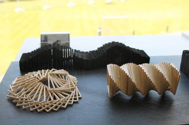
As impressive as all the planning and development pages of the architecture students' work was , I was mostly drawn to the sculptural elements of their exhibitions.I have an extremely limited knowledge of architecture and left with an idea of the sheer volume of work and planning that is required to design these innovative buildings.


I understand that I've been largely quite critical of the work , but as a whole I found it really eye-opening.
It's really great to see new waves of artists and designers and their ideas displayed on such a large scale.The exhibition is on until 12th June - there's only one day left to see it , but I would highly recommend having a look , you could spend from just 20 minutes having a quick glance at some of the work on offer or you could spend a whole afternoon fully  absorbing the artistic expression surrounding you.
Kate
xo